scipy.stats.
relfreq#
- scipy.stats.relfreq(a, numbins=10, defaultreallimits=None, weights=None)[源代码]#
返回一个相对频率直方图,使用 histogram 函数。
相对频率直方图是每个 bin 中观测数量与总观测数量的比率的映射。
- 参数:
- aarray_like
输入数组。
- numbinsint, 可选
直方图使用的 bin 的数量。默认为 10。
- defaultreallimitstuple (lower, upper), 可选
直方图范围的下限和上限值。 如果未给出值,则使用比 a 中值的范围稍大的范围。 具体来说,
(a.min() - s, a.max() + s),其中s = (1/2)(a.max() - a.min()) / (numbins - 1)。- weightsarray_like, 可选
a 中每个值的权重。 默认为 None,这为每个值提供 1.0 的权重
- 返回:
- frequencyndarray
相对频率的分箱值。
- lowerlimitfloat
下限实际值。
- binsizefloat
每个 bin 的宽度。
- extrapointsint
额外的点。
示例
>>> import numpy as np
>>> import matplotlib.pyplot as plt
>>> from scipy import stats
>>> rng = np.random.default_rng()
>>> a = np.array([2, 4, 1, 2, 3, 2])
>>> res = stats.relfreq(a, numbins=4)
>>> res.frequency
array([ 0.16666667, 0.5       , 0.16666667,  0.16666667])
>>> np.sum(res.frequency)  # relative frequencies should add up to 1
1.0
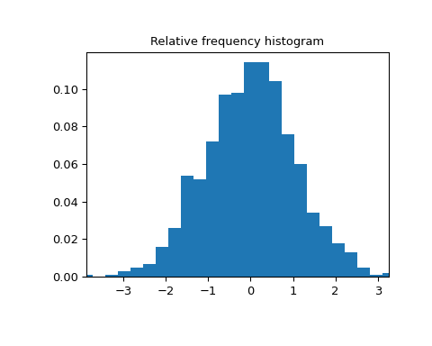
创建一个具有 1000 个随机值的正态分布
>>> samples = stats.norm.rvs(size=1000, random_state=rng)
计算相对频率
>>> res = stats.relfreq(samples, numbins=25)
计算 x 的值空间
>>> x = res.lowerlimit + np.linspace(0, res.binsize*res.frequency.size,
...                                  res.frequency.size)
绘制相对频率直方图
>>> fig = plt.figure(figsize=(5, 4))
>>> ax = fig.add_subplot(1, 1, 1)
>>> ax.bar(x, res.frequency, width=res.binsize)
>>> ax.set_title('Relative frequency histogram')
>>> ax.set_xlim([x.min(), x.max()])
>>> plt.show()