scipy.stats._result_classes.FitResult.
plot#
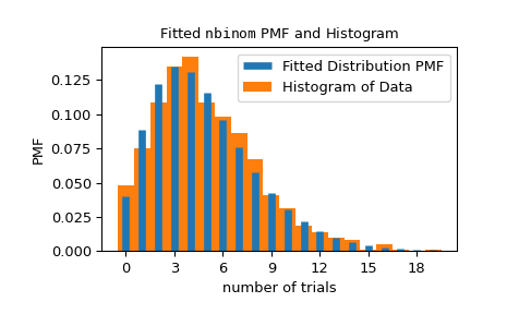
- FitResult.plot(ax=None, *, plot_type='hist')[source]#
直观地比较数据与拟合分布。
仅在安装了
matplotlib时可用。- 参数:
- ax
matplotlib.axes.Axes 要在其上绘制绘图的轴对象,否则使用当前轴。
- plot_type{“hist”, “qq”, “pp”, “cdf”}
要绘制的绘图类型。选项包括
“hist”: 将拟合分布的 PDF/PMF 叠加在数据的标准化直方图上。
“qq”: 理论分位数与经验分位数的散点图。具体来说,x 坐标是在百分位数
(np.arange(1, n) - 0.5)/n处评估的拟合分布 PPF 的值,其中n是数据点的数量,y 坐标是排序后的数据点。“pp”: 理论百分位数与观察到的百分位数的散点图。具体来说,x 坐标是百分位数
(np.arange(1, n) - 0.5)/n,其中n是数据点的数量,y 坐标是在排序后的数据点处评估的拟合分布 CDF 的值。“cdf”: 将拟合分布的 CDF 叠加在经验 CDF 上。具体来说,经验 CDF 的 x 坐标是排序后的数据点,y 坐标是百分位数
(np.arange(1, n) - 0.5)/n,其中n是数据点的数量。
- ax
- 返回值:
- ax
matplotlib.axes.Axes 在其上绘制绘图的 matplotlib Axes 对象。
- ax
示例
>>> import numpy as np
>>> from scipy import stats
>>> import matplotlib.pyplot as plt  # matplotlib must be installed
>>> rng = np.random.default_rng()
>>> data = stats.nbinom(5, 0.5).rvs(size=1000, random_state=rng)
>>> bounds = [(0, 30), (0, 1)]
>>> res = stats.fit(stats.nbinom, data, bounds)
>>> ax = res.plot()  # save matplotlib Axes object
matplotlib.axes.Axes对象可用于自定义绘图。 有关详细信息,请参阅matplotlib.axes.Axes文档。>>> ax.set_xlabel('number of trials') # customize axis label >>> ax.get_children()[0].set_linewidth(5) # customize line widths >>> ax.legend() >>> plt.show()